CLIENT
Riot Games
PROJECT TYPE
Creative Direction
Brand identity
Sound Design
Animation
Since its founding, Riot Games has been known primarily for its massive MOBA hit League of Legends. Over the course of a few years, Riot expanded its game portfolio to include Wild Rift, VALORANT, TFT, and various Forge indie titles. With the arrival of its first animated show, Arcane, they realized the need for a more modern and expansive brand identity that could elevate its IPs but is also striking and commanding on its own.
RIOT GAMES GLOBAL MARKETING CREATIVE
Long Vu - Creative Director
Julie Morrandez - Lead Producer
John Battle - Head of Creative, Global Marketing
Sean Balas - Sound Design
John Furnari - Director, Brand Management
Chris Hoag - Brand Manager
and contributions by many Rioters along the way
MOTION - I LOVE DUST
CUSTOM TYPEFACE - COLOPHON
Logomark:
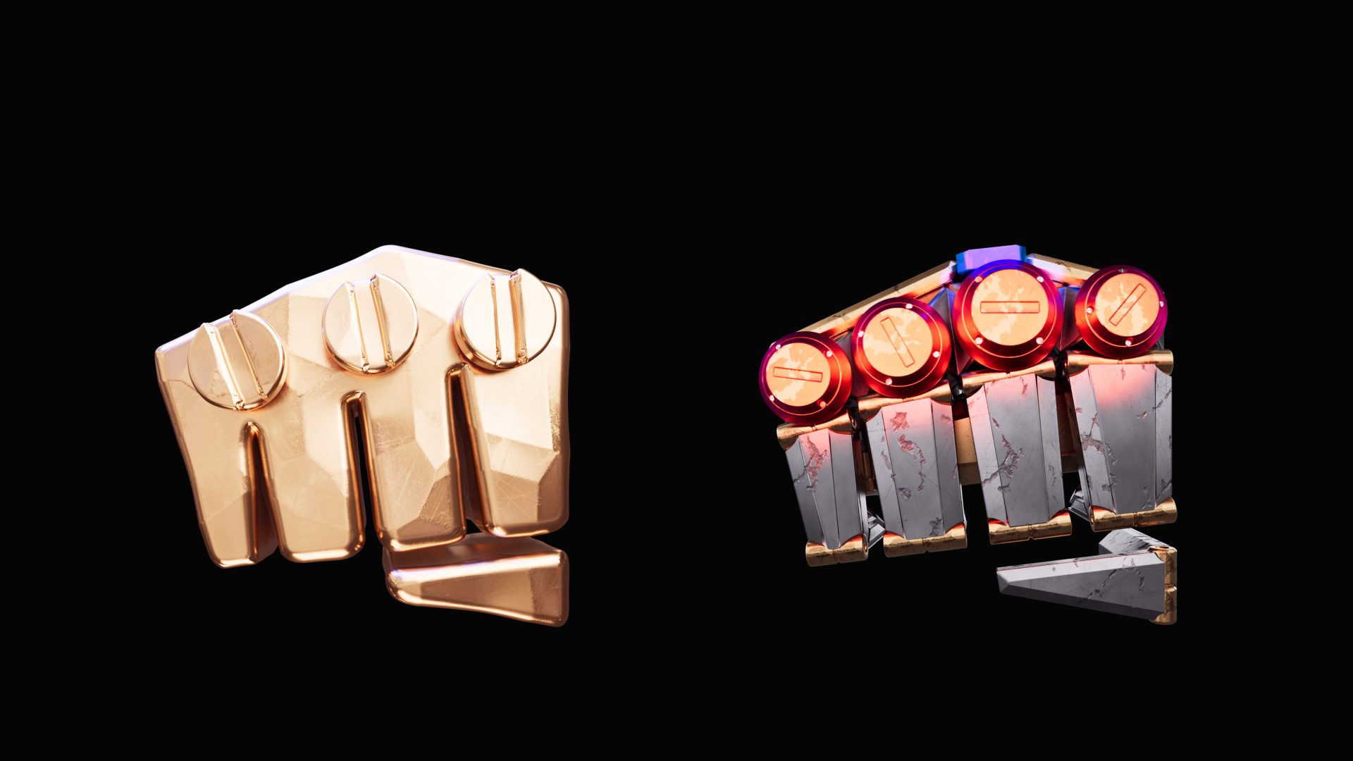
Investing the legacy of the icon
The fist icon has been part of Riot Games logos since its founding. Over the years, the logo evolved, and with it, the fist took on different forms. It had always been challenging to utilize the fist in design due to its inconsistent forms and organic shapes. On top of that, there was no real brand visual system besides the red color and hand-drawn types that were difficult to scale.
With this rebrand, we set out to develop an identity that is dynamic, flexible, modern in style, yet functional and supportive of our spectrum of content. We also want to invest in the future, building equity around the fist, making it iconic and distinctly own-able by Riot.
I re-drew the fist icon to make the angles and distances between anchor points more uniform. This allowed the challenging shape and it’s gaps to look even and consistent. I also introduced a slight tilt to the fist to: 1-give it a sense of dimensionality, 2-allow some flexibility with logotype alignment.
Brand Visual System
Responsive:
Riot Sans Typeface
Custom Typeface
Scalable:
Illustration System
Experimental:
Custom Riot Fists
Irreverent:
Motion & Sound


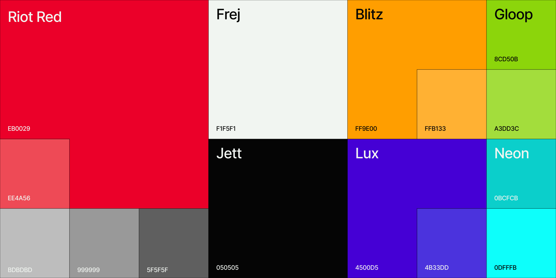
Energetic yet adaptive color palette
Red is the original brand color of Riot, it appeared consistently across all visual communication and expressions, and players associate it with the brand. While it's a commmonly seen brand color within gaming industry, the initial instinct would be to downplay it in favor of something more neutral palette. We decided to go all in and crank up the volume on the red, using it in important touchpoints like the end cards, but in heavier dose to command attention. We also updated the red to be more saturated for accessibility against white and black, and tone down the intensity for larger surfaces.
The secondary palette is inspired by the elements within the IP, gold and blue to represent League of Legends, and neon colors as highlights.
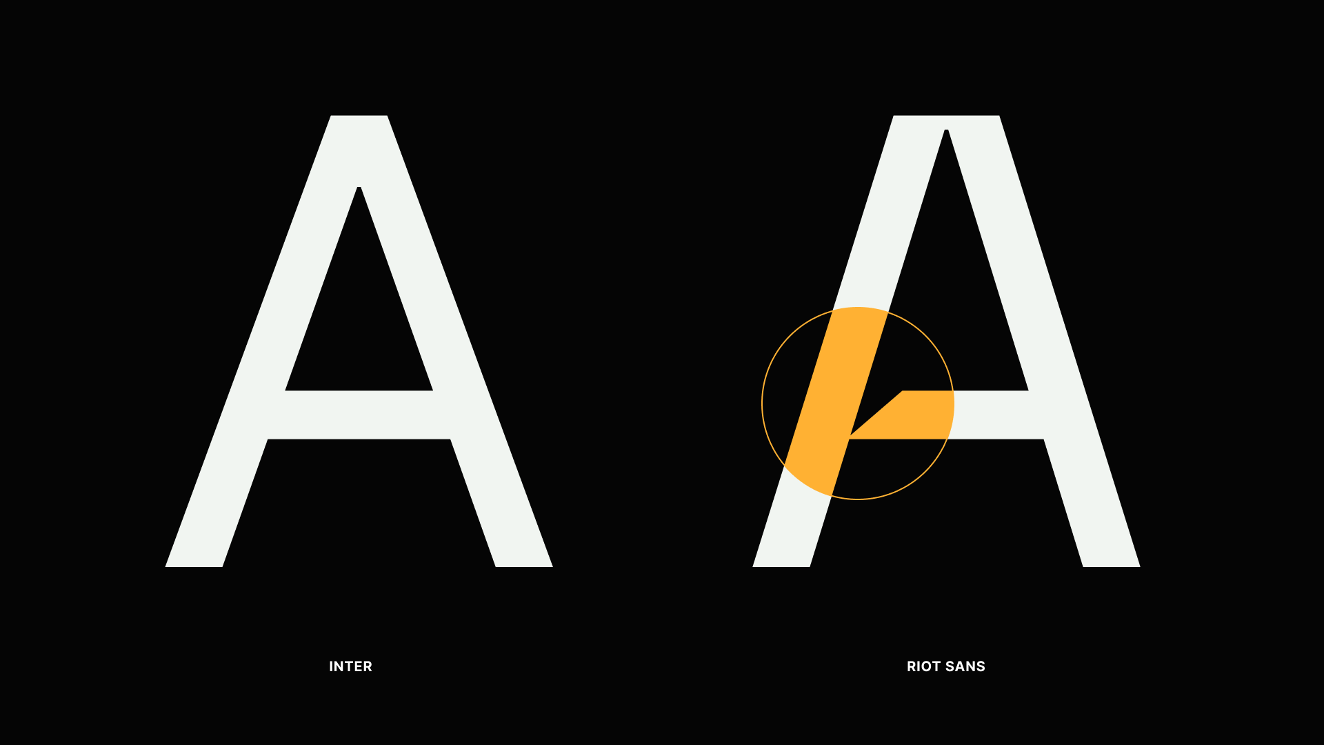
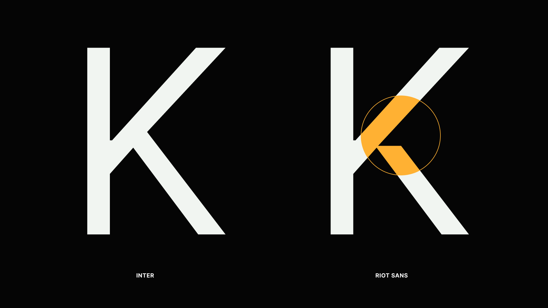
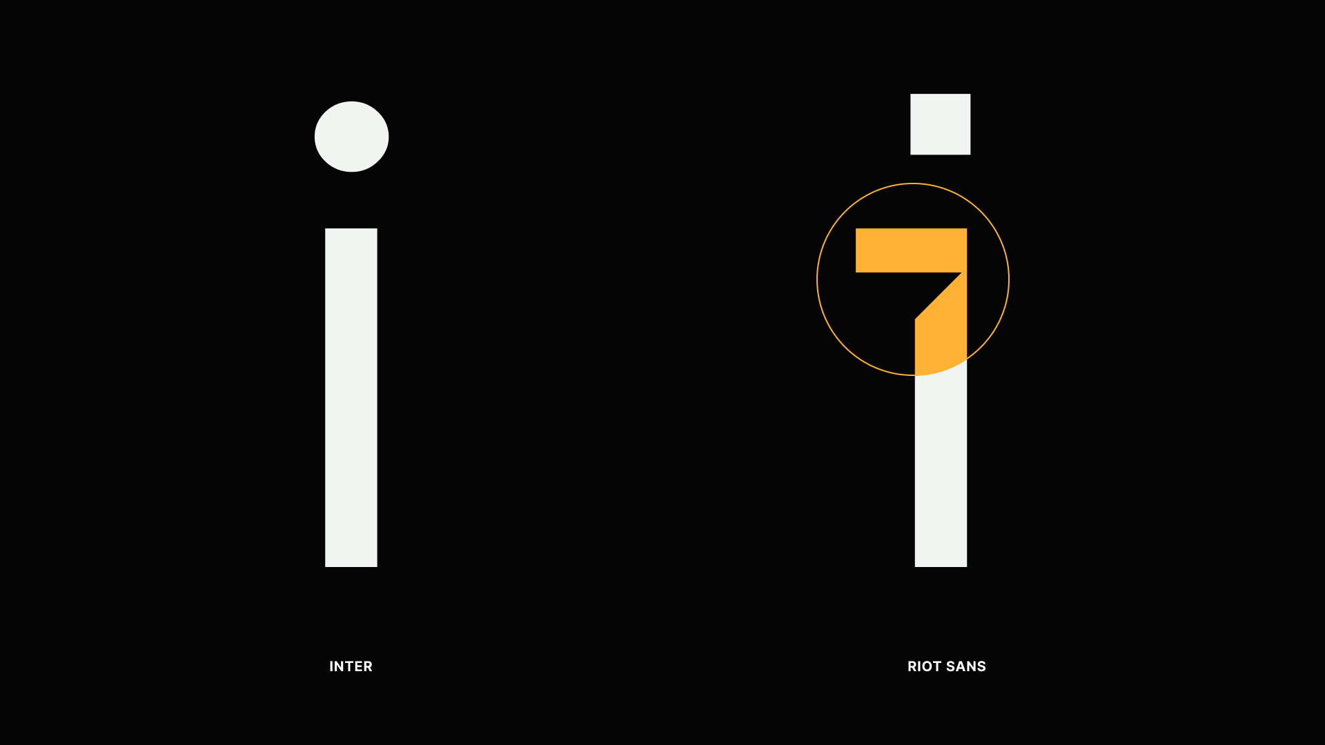
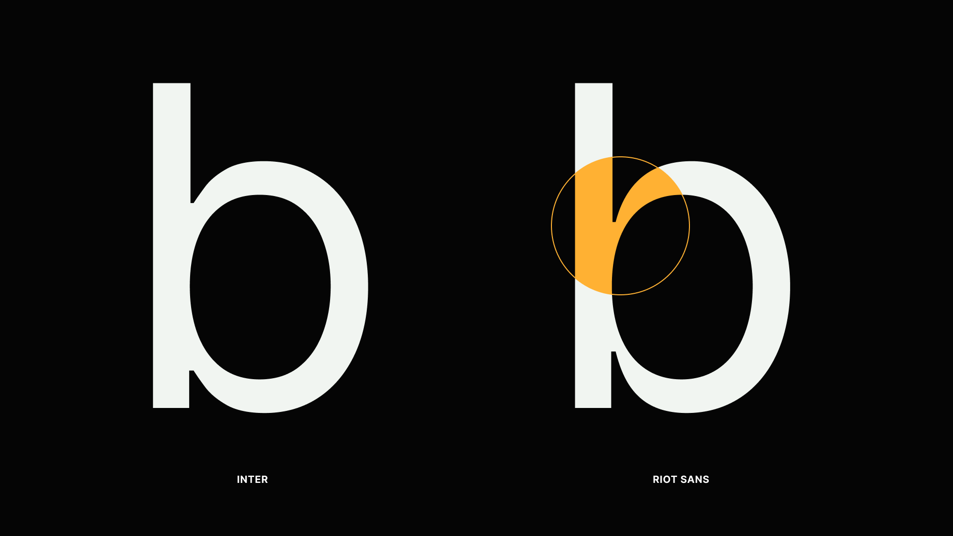
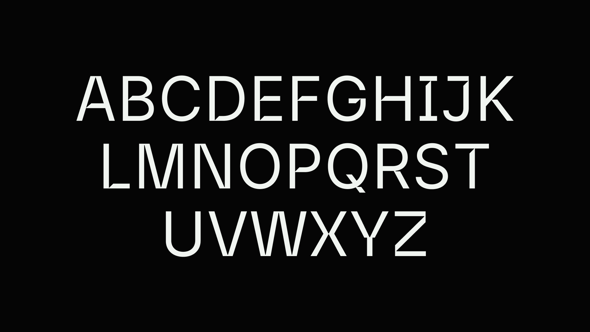
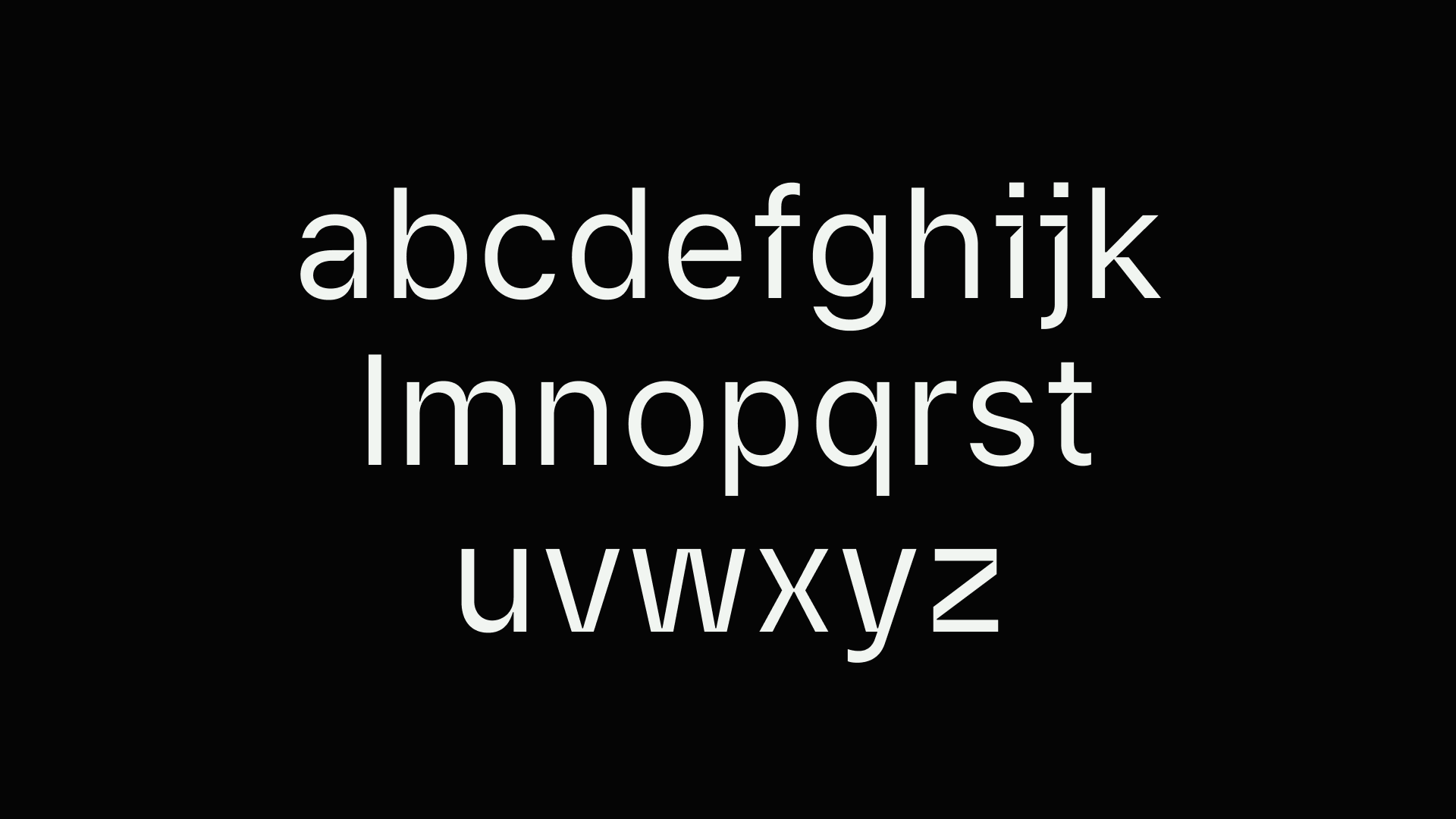
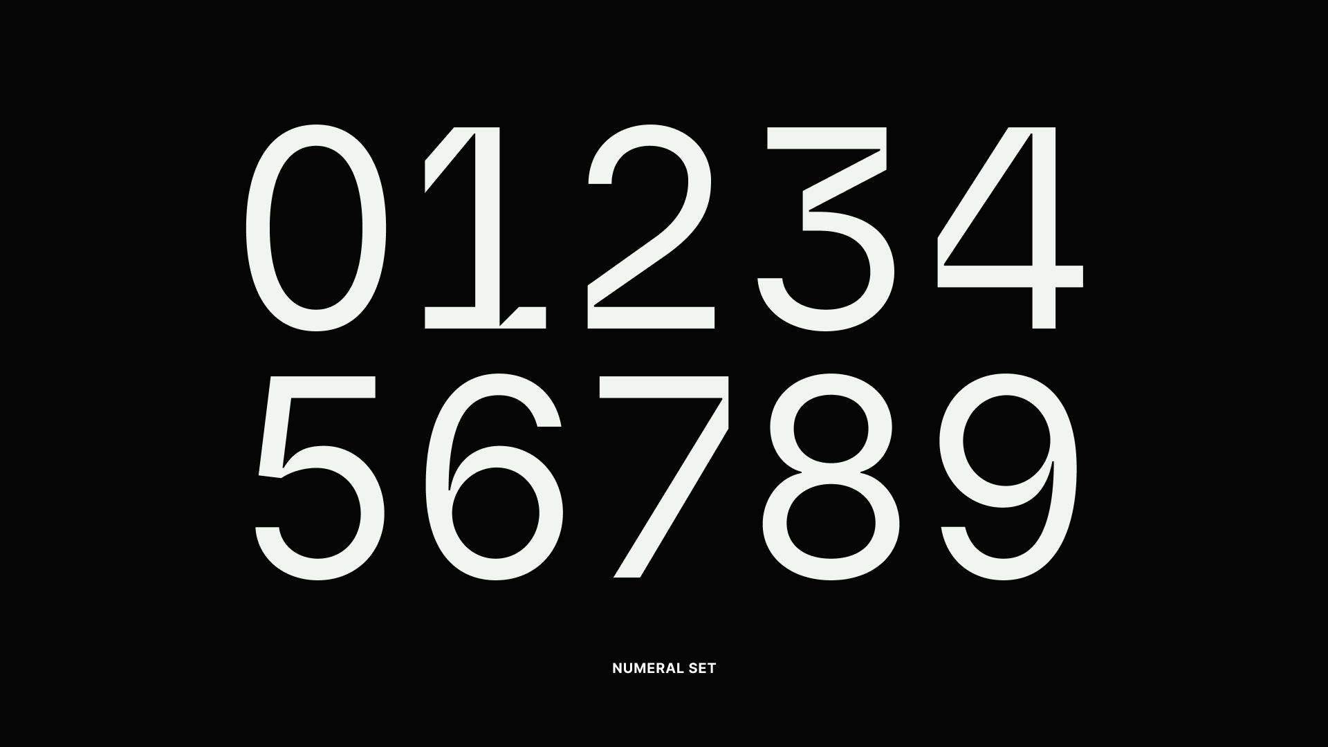
Riot Sans: custom typeface
Riot Sans is a derivative of the Riot Games logotype. The typeface took inspiration from the customized cuts on the word mark. The ink traps are designed to give the letters a dimensional look with implied shadow. They give the typeface personality while retaining its functionality as workhorse.
In certain words, the ink traps might look excessive. We addressed that by introducing contextual alternatives that let users to turn off the ink traps in certain letters for maximum legibility.


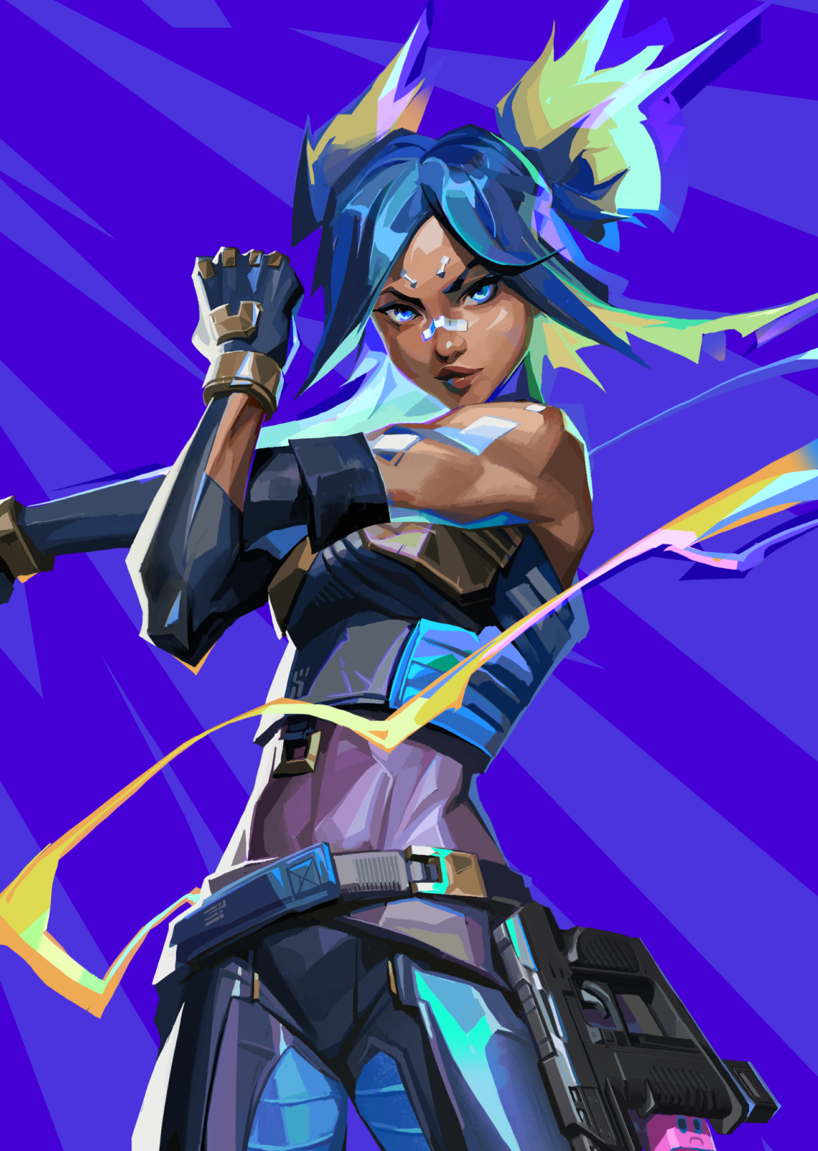
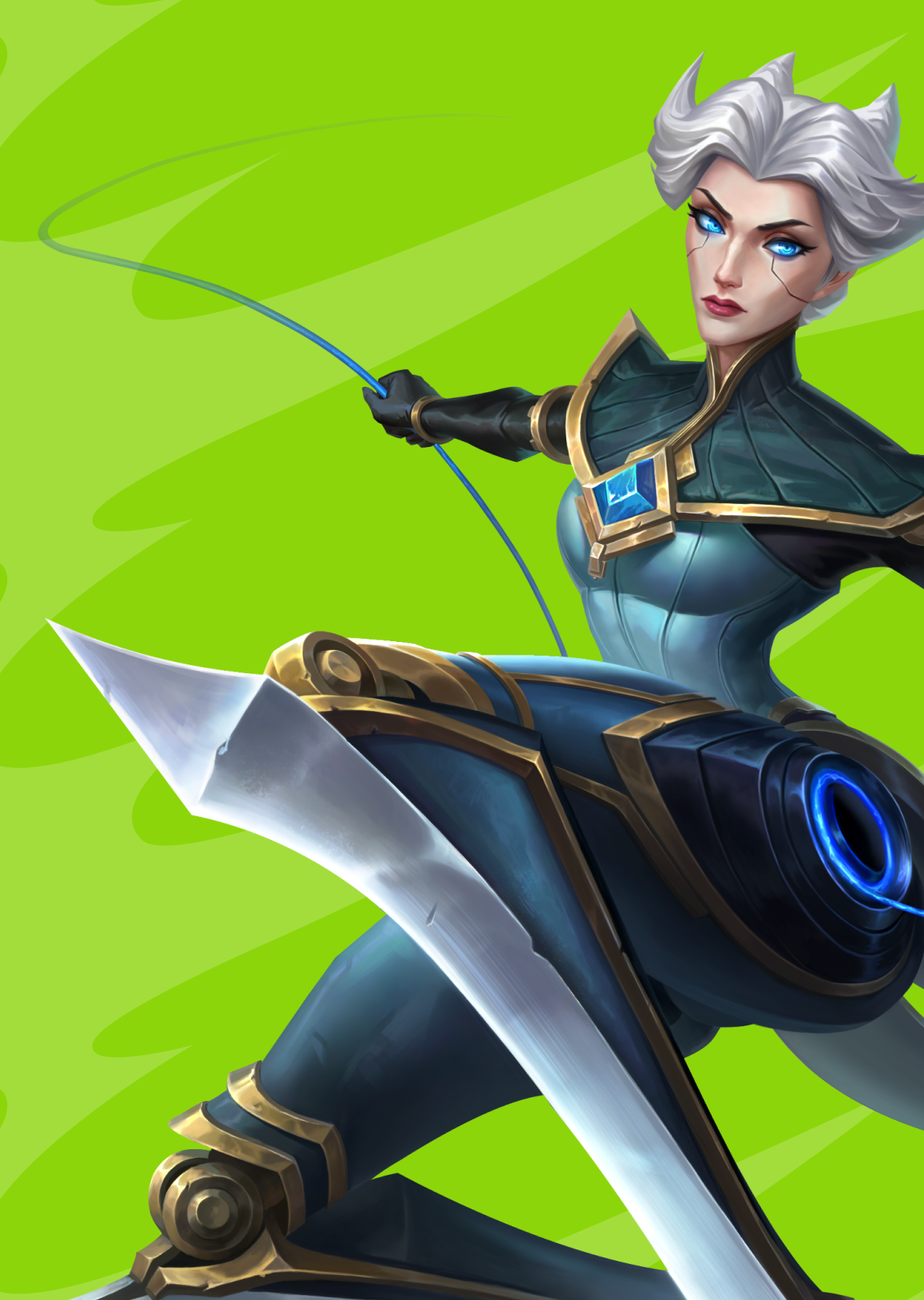
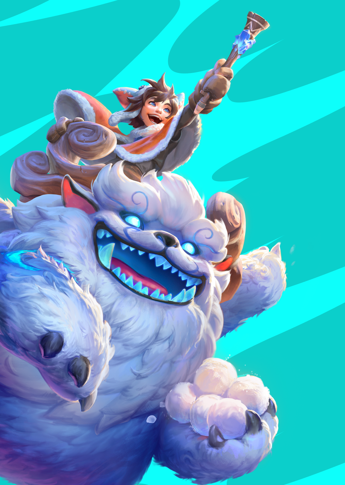
Scaleable Illustration System
Riot has always placed heavy emphasis on art and illustration, with so many games and IPs, the inherent of style discrepancy posed a challenge to design when we needed to speak as a collective Riot. We developed an art system with specific stylistic choices that allows us to illustrate cross-IP characters as well as players in the same rendering target. It also allows us to commission artists to create illustrations with greater consistency.


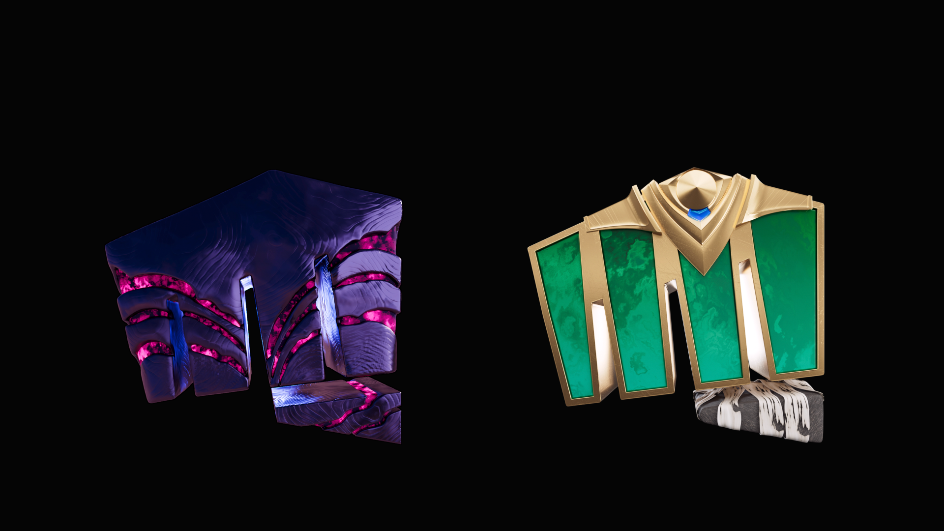
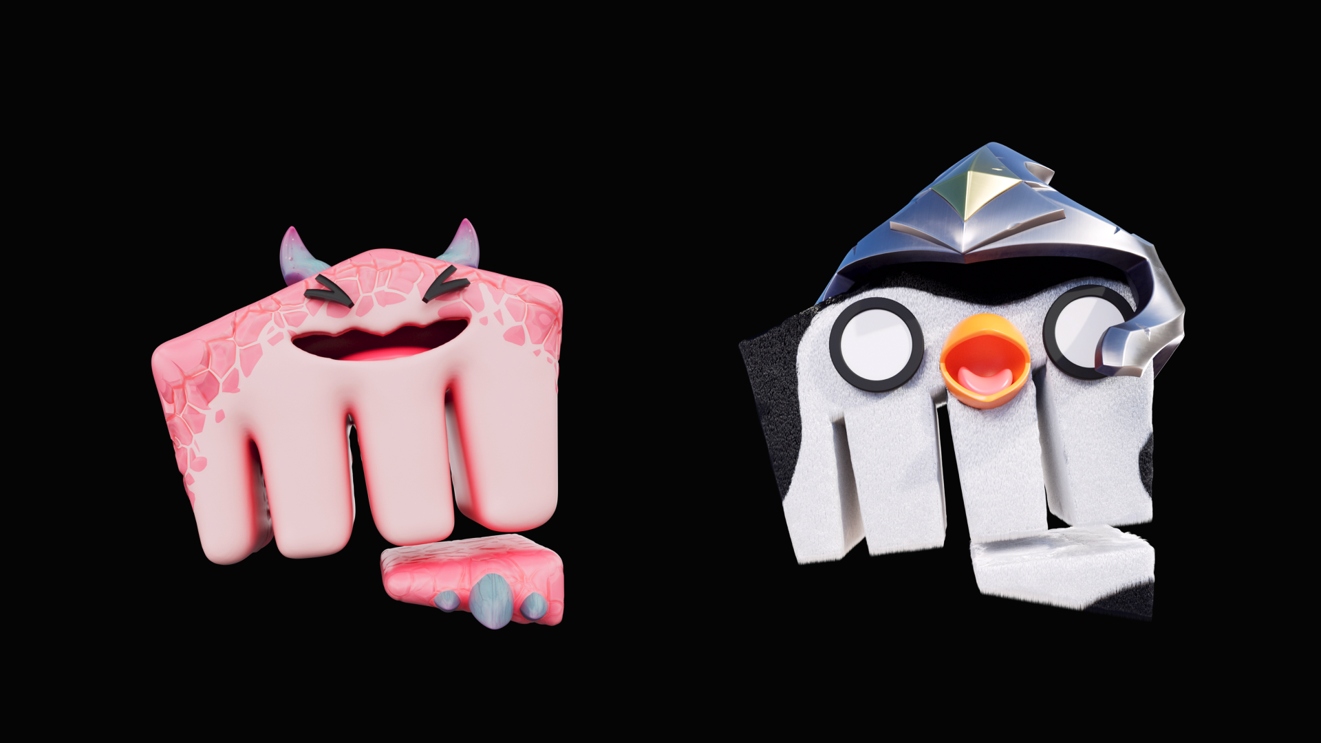
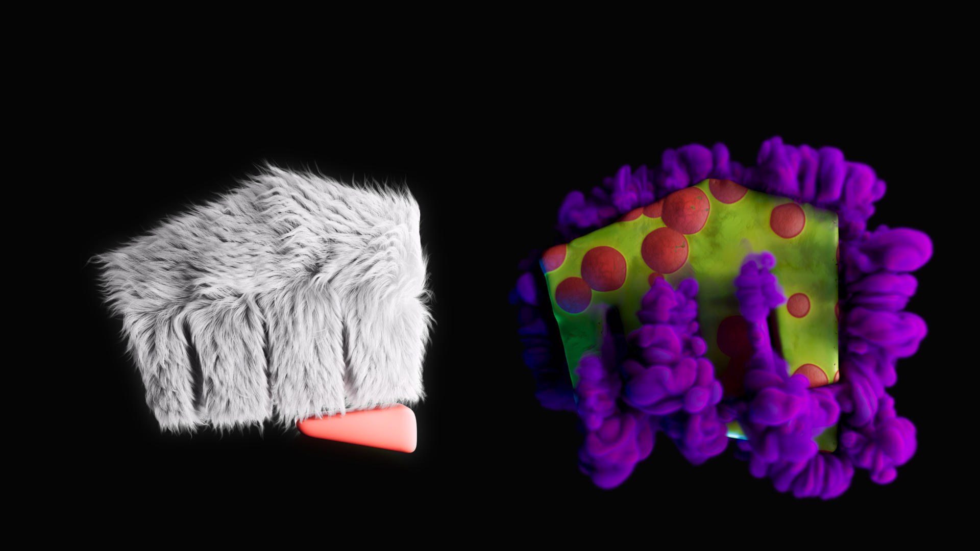
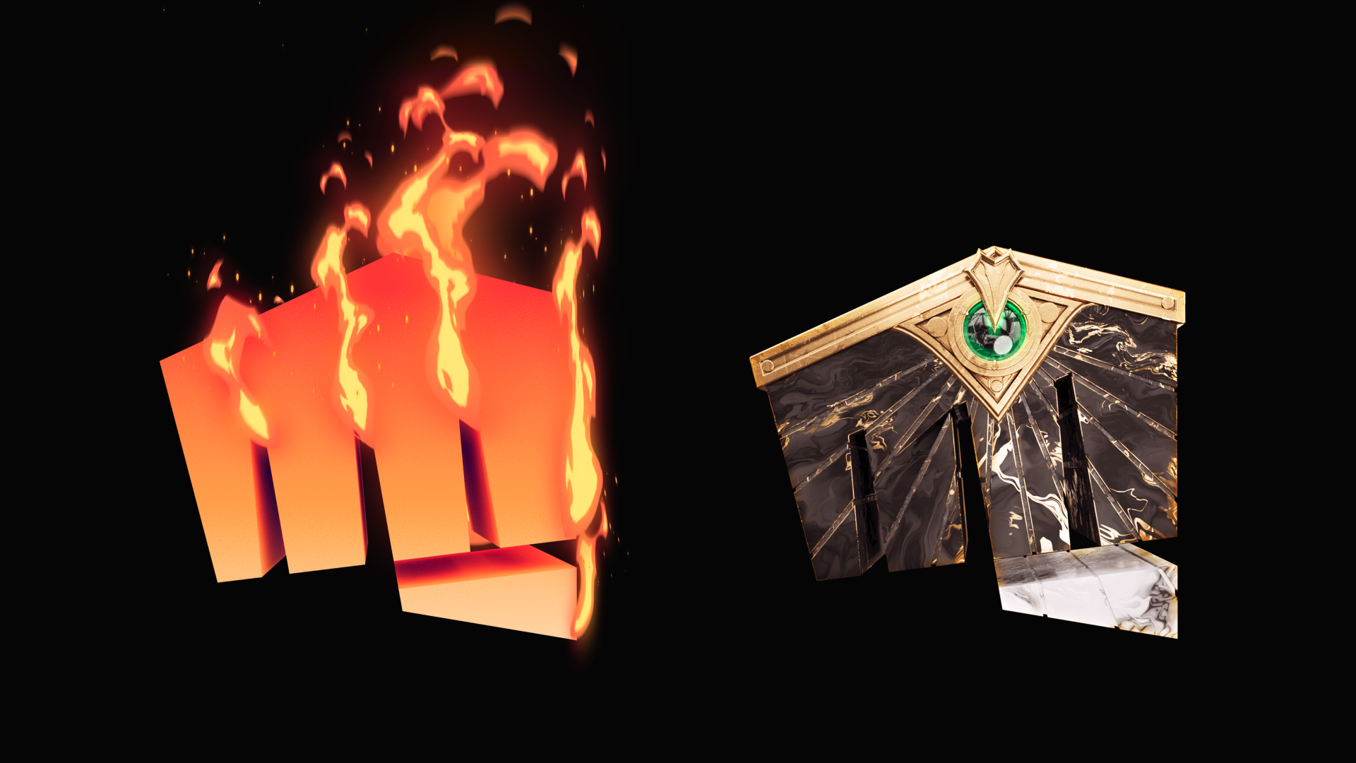
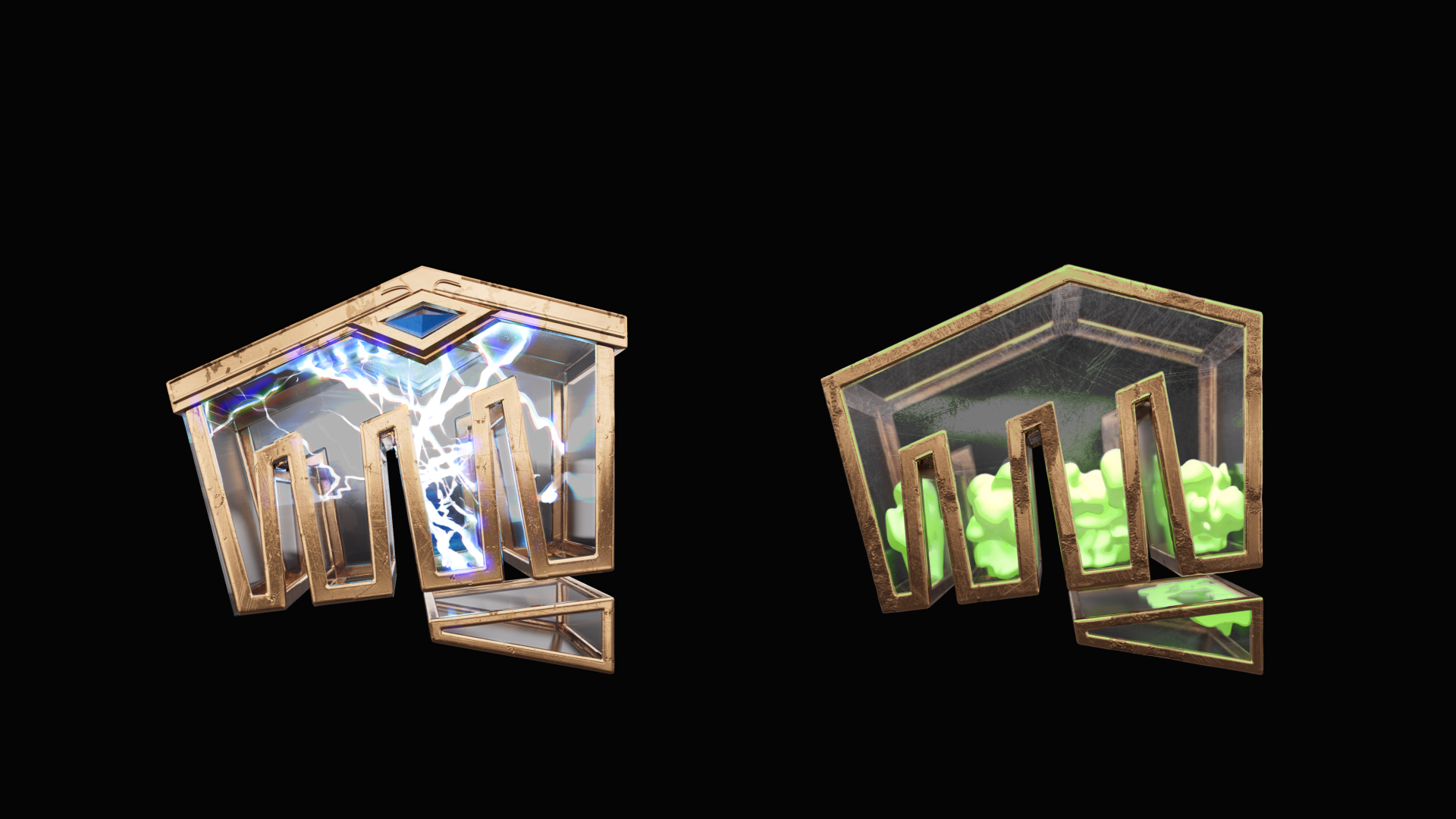
Logo icon as canvas for expression
On its own, the logo mark works well as an icon; however, it needs to be more than just a mark if it wants to reflect who we are and our vast wealth of IPs. The refinements to the logo mark come in play with the 3D expressions of the fist where they take on the forms of the IPs that they represent. This system extends the usage of the mark and provides almost limitless possibilities to our brand's expressions in the future.
Motion: Mirage
We deliver excitement and energy by using rhythmic quick bursts, hard cuts, expanding and contracting motions. The stuttering motion, a deliberate nod at the frame rate lag online players experience, delivers the opposite effect — speed and constant motion — when applied to type and transition as well as indents.


Bumpers, indents, and sound
Following the same motion principles, our intro and end card applied the rhythmic hard cut to disrupt and attract attention. The fist motion is a nod to our founders' original intent for the fist, a symbol of breakthrough and a challenge to the status quo. Knowing the contexts in which these indents display, the hard cut serves a functional purpose. The hard cut, in itself, is neutral, which works well when butted up against high fantasy motion of League, and the disruptive modern feel of VALORANT.
The mnemonic was an exercise of finding a game-agnostic sound that carries the essences of Riot. We wanted something that has a fantastical/magical undertone, yet is raw and confident at the same time. The riser delivers a staticky vibration that resembles a wave crashing or a crowd cheering (which is a nod at our fandom), with two strong beats at the end to pay off the punchy motion.
Putting it all together
This cinematic indent was the result of all the work that happened across the visual pillars. It is used as the cold opening for all our esports livestream broadcasts as well as big arena events like LCS Finale.