CLIENT
Riot Games - League of Legends
PROJECT TYPE
Creative/Art Direction
Interactive
Branding
RECOGNITION
FWA
↳ Site of the Day
Awwwards
↳ Site of the Day
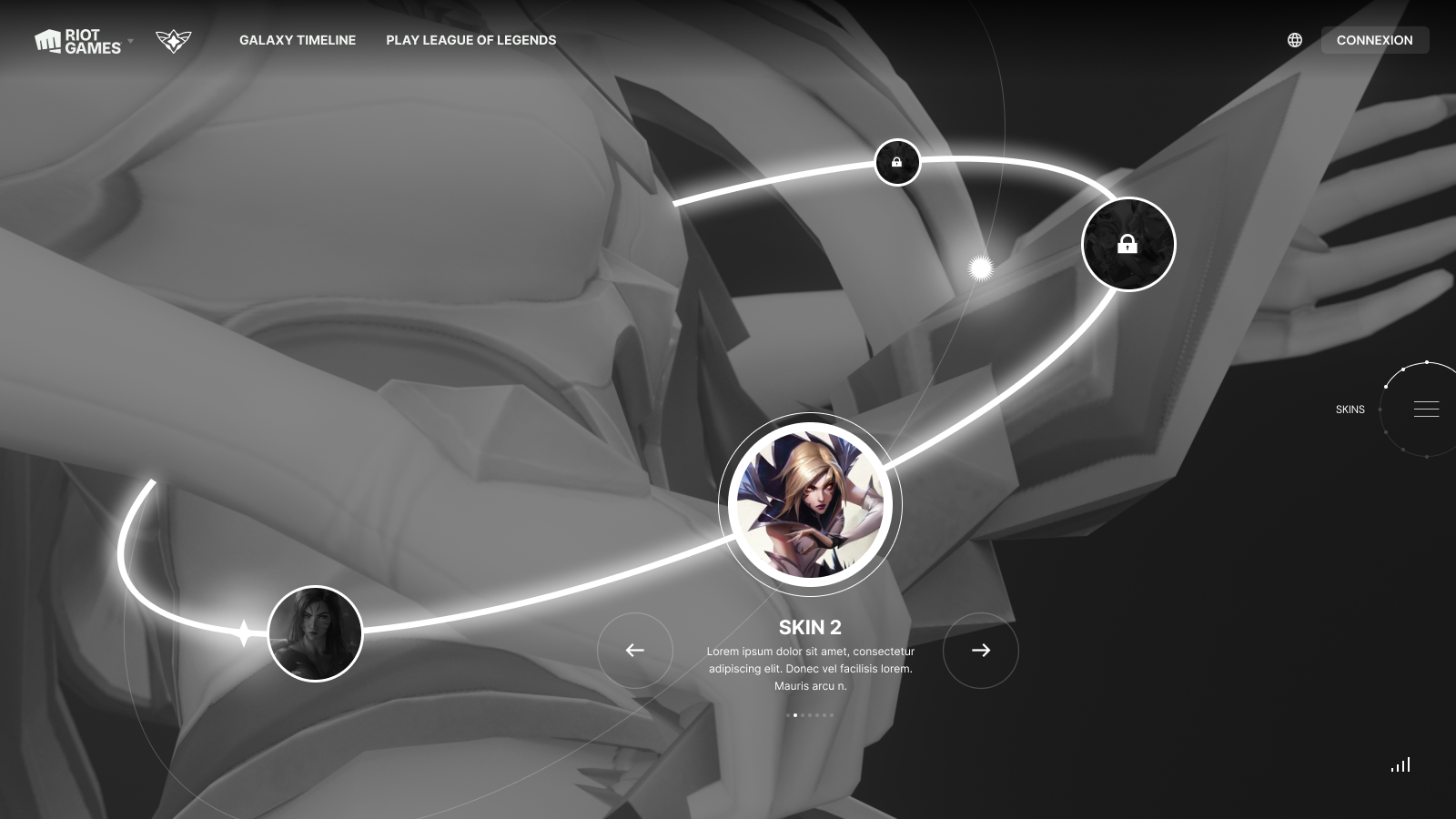
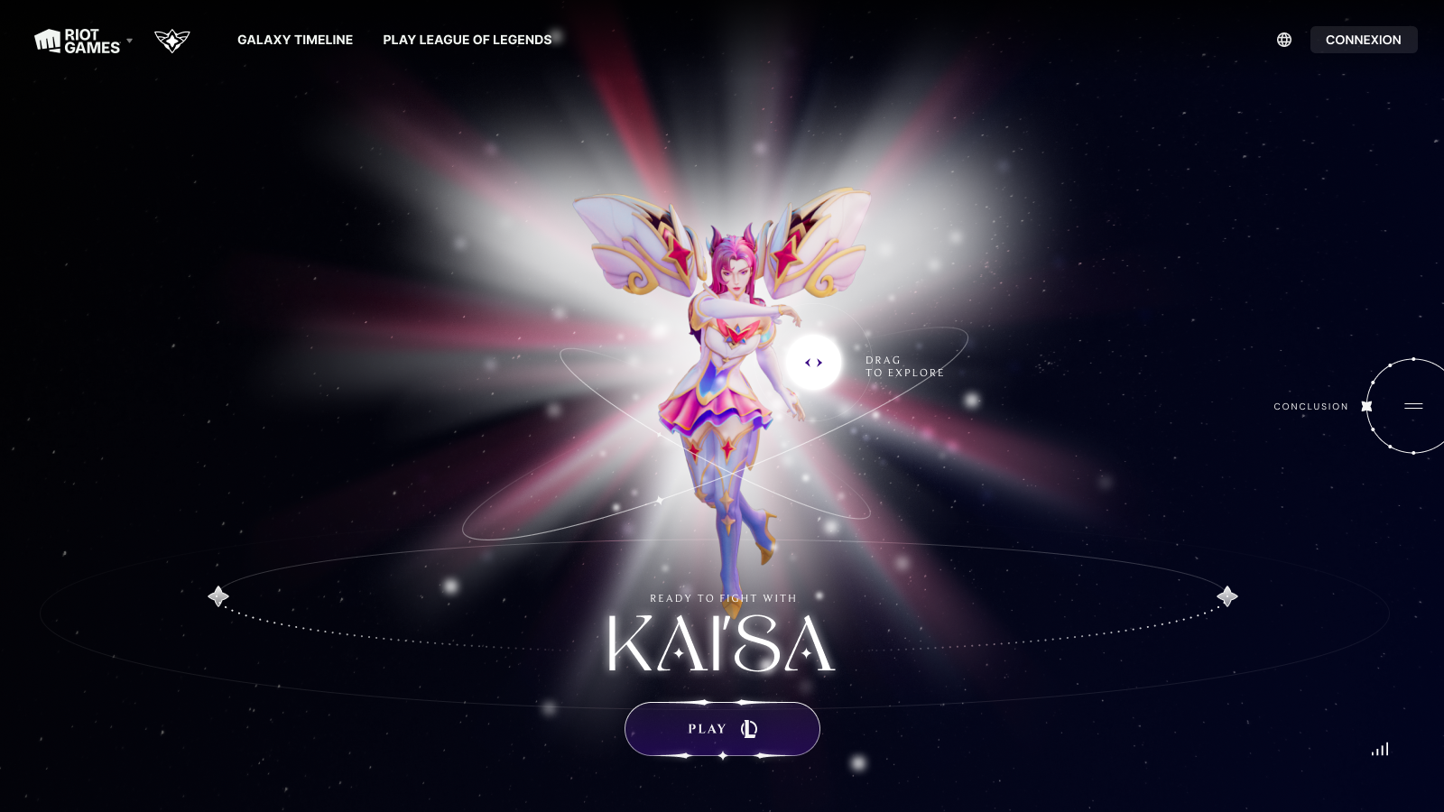
Star Guardian (SG) is among the most successful skinlines in League of Legends, it's League's take on the Magical Girl genre, which features its all-star lineup. For the launch of its 4th chapter, the universe needed a grander presence to match its scale. As part of the campaign, I led the brand refresh and the interactive hub that highlights the skin lineup and serves as gateway to all the SG content.
RIOT GAMES CREATIVE TEAM
Long Vu - Design Director
Austin Veiger - Senior Brand Designer
Thiago Gutierrez - Campaign Creative Director
League PIE team - splash arts and illustrations
SITE DEVELOPMENT - MAKEMEPULSE
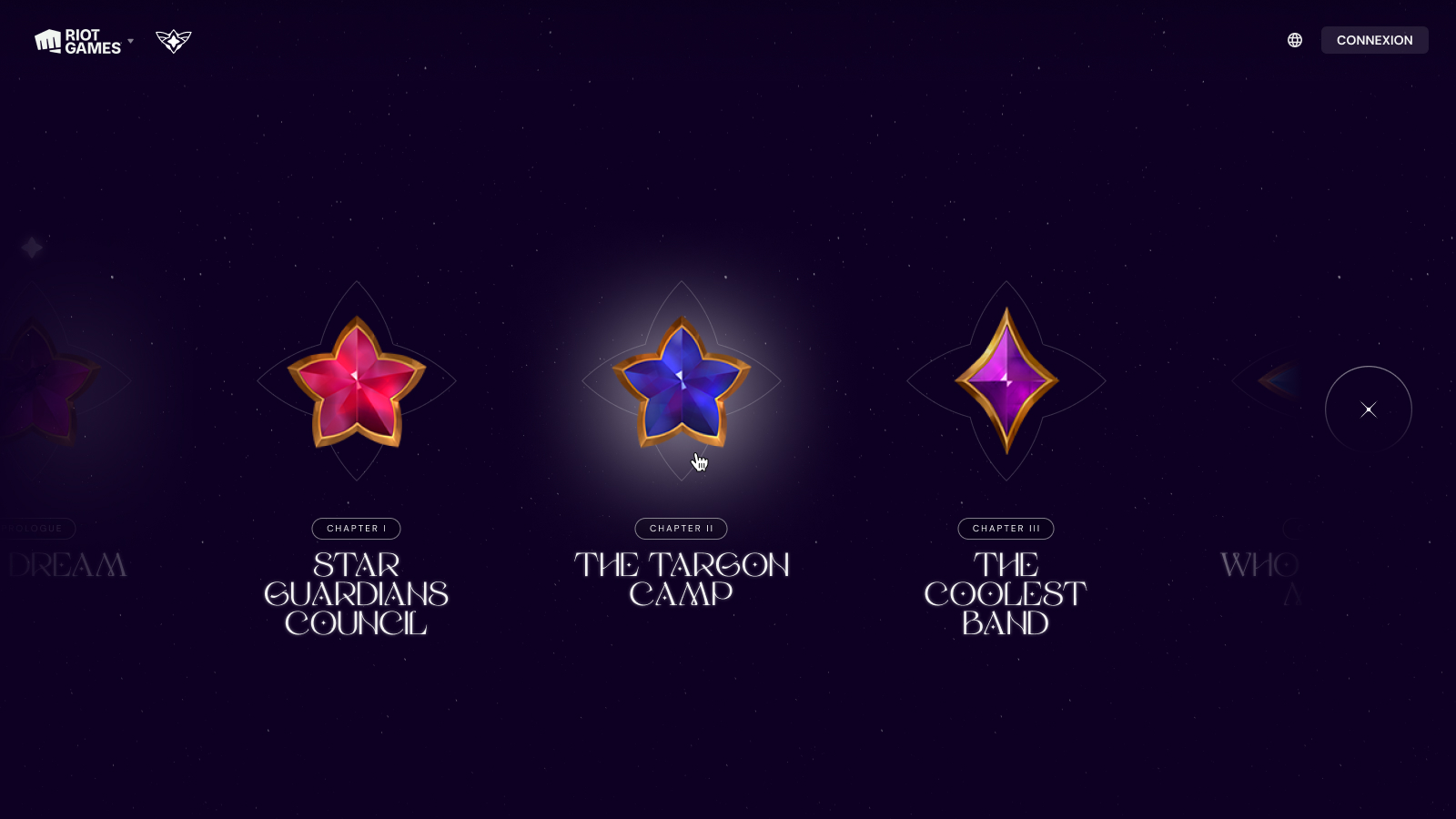
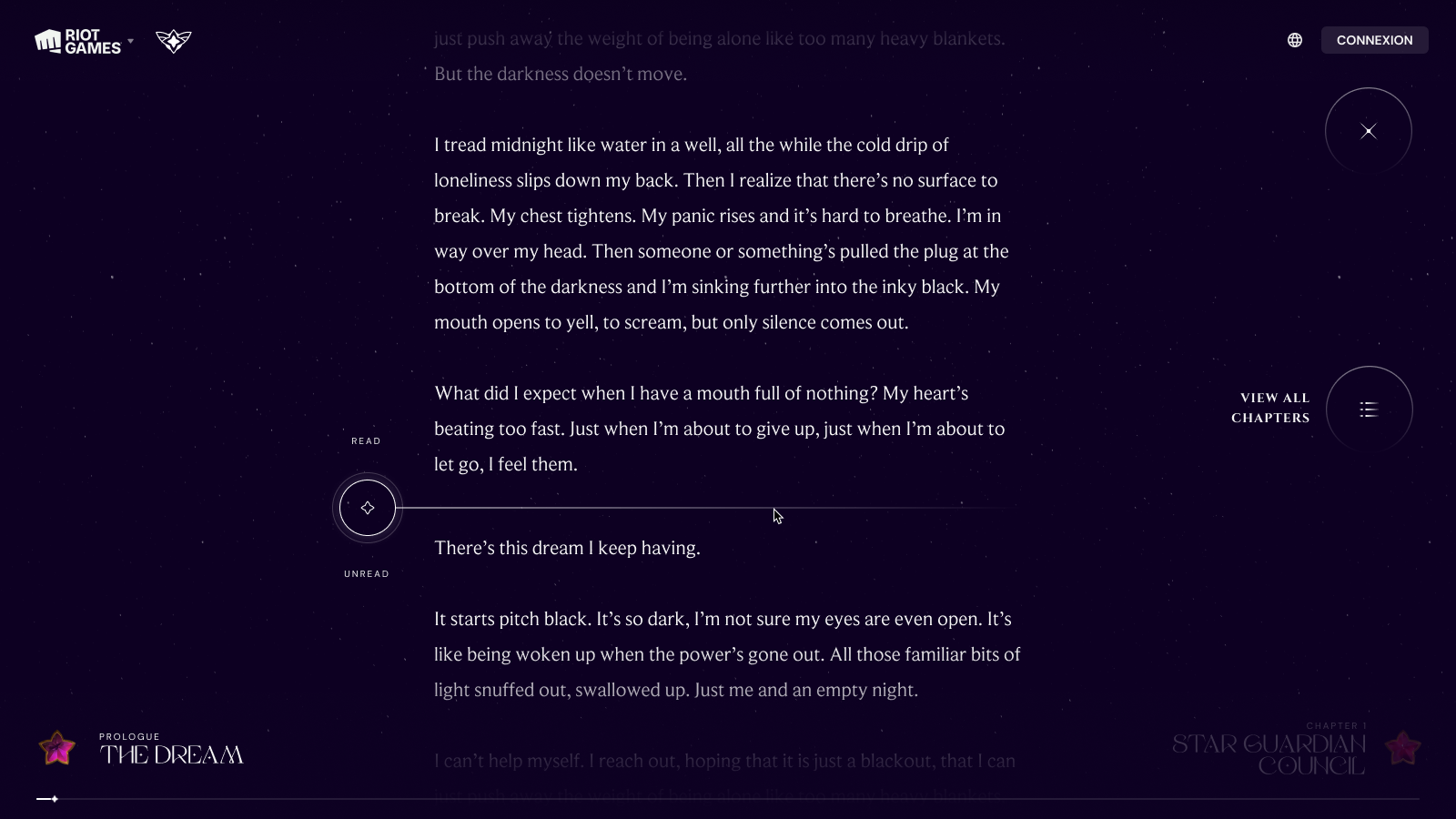
The Star Guardian site was launched as the kickoff for the summer long campaign. It showcases the skinlines and story beats as they unfold throughout the campaign. The goal is to take fans beyond the marketing campaign by diving into the lore, behind the scene, and cross games-integrations between League, Wild Rift, and Legends of Runeterra.
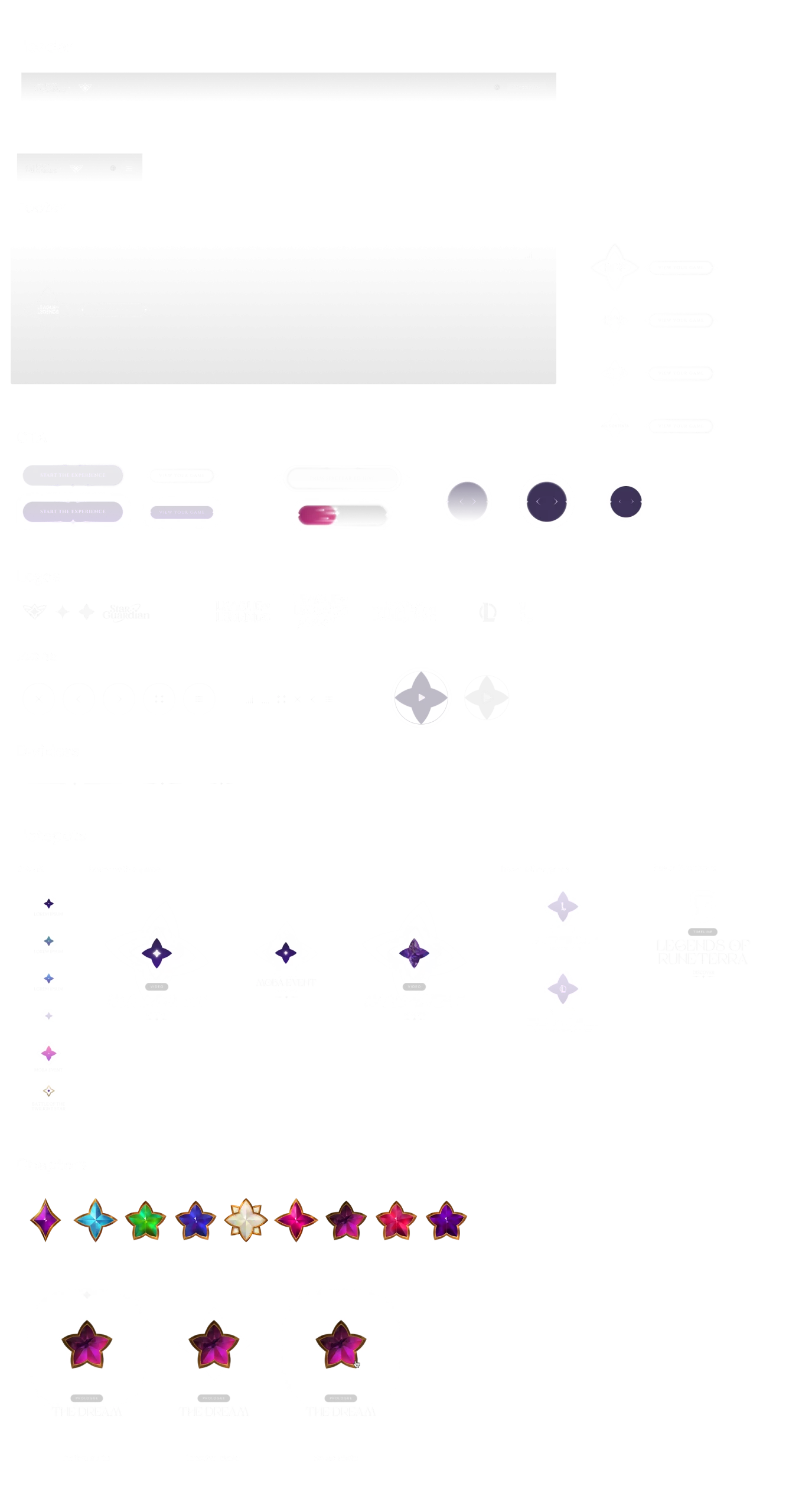
Design System
The site's UI are drawn from the Star Guardian brand, with a lot of delicate framing, shimmering gradients, and soft glow to create the ethereal feel. Same principles are applied to the motion and micro-interaction, where hovers and clicks feel magical and alive.
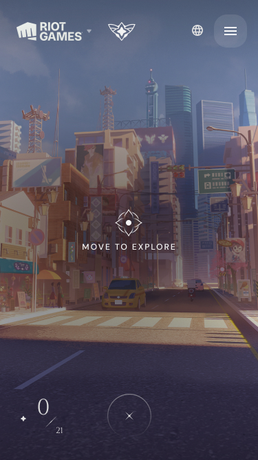
Prioritize mobile game audience
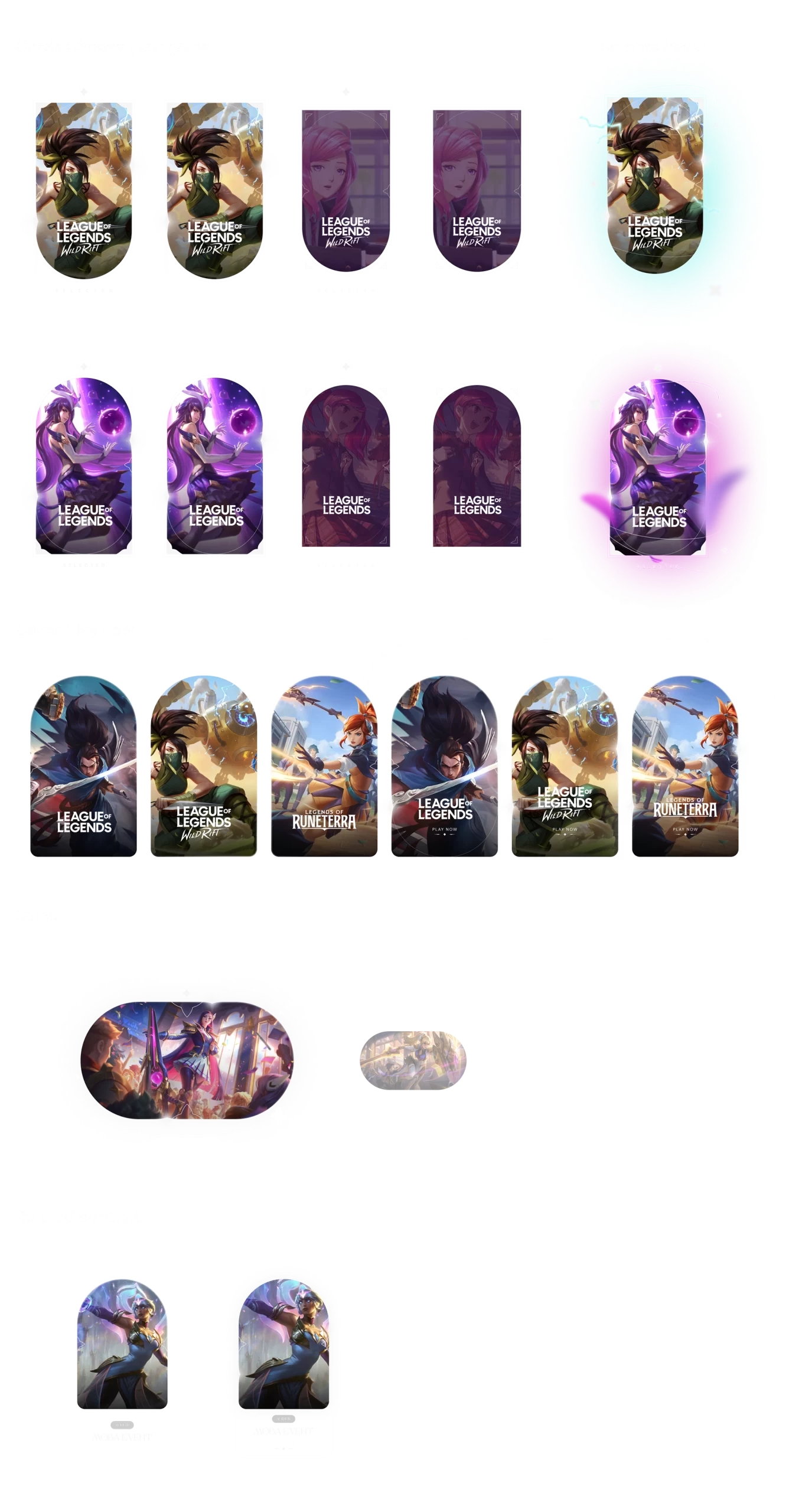
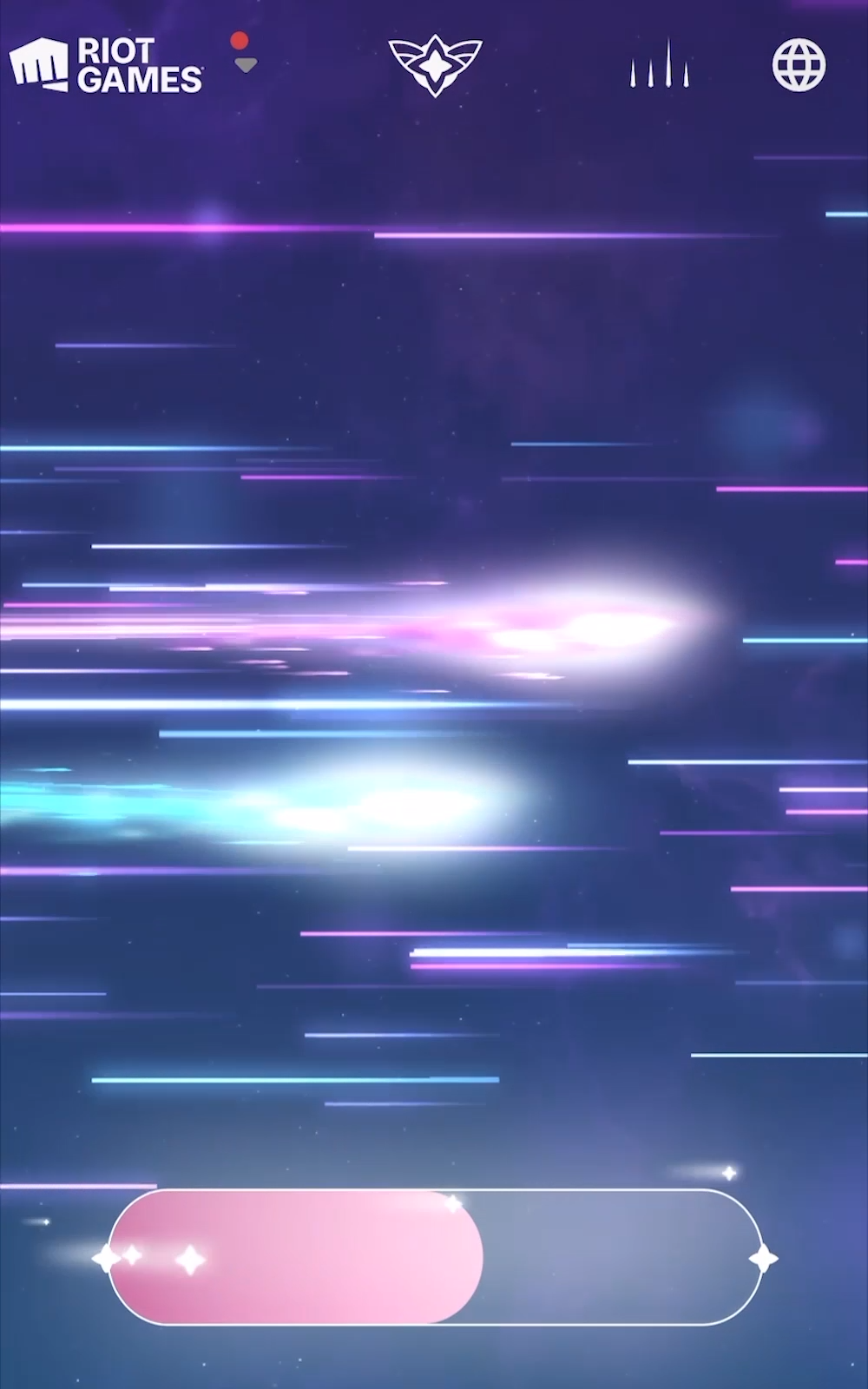
From the start, we identified mobile users as a large part of our audience given that the skinline features both League and Legends and Wild Rift (its mobile game) skins, and some of them are exclusive to mobile. Therefore, the webGL and 3D components need to be streamlined for optimal viewing experience. Content related to Wild Rift is also presented in vertical format as a form of vlog to feel more native to player base.
Unlock Rewards as Dedicated Fan
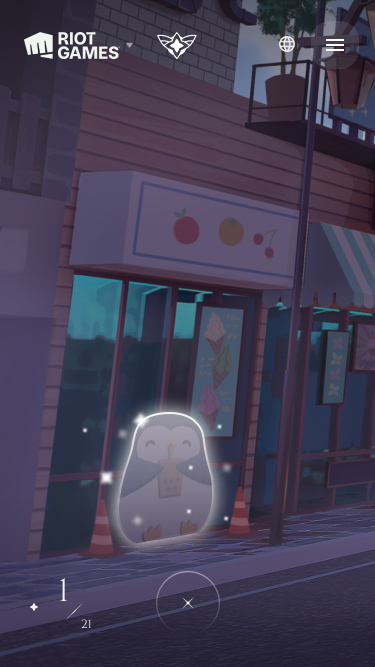
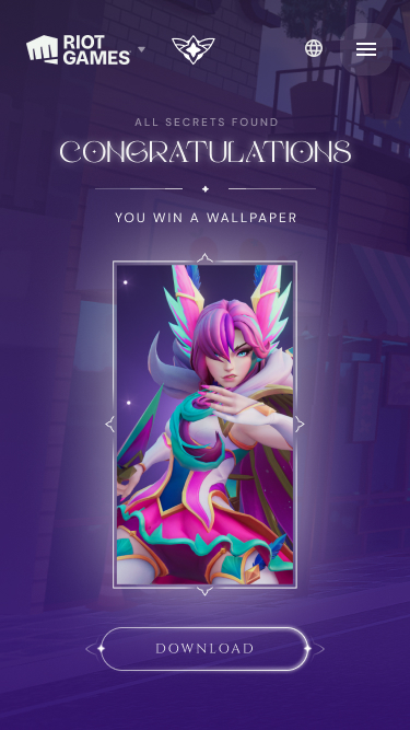
The site also features a piece of exclusive bonus content in the form of a puzzle where players can engage and unlock different downloadable rewards.
Unused concepts
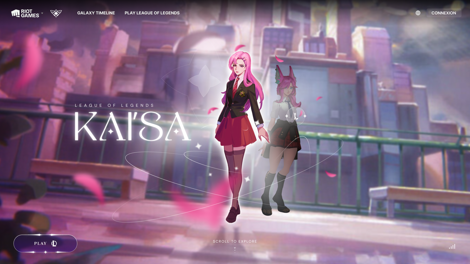
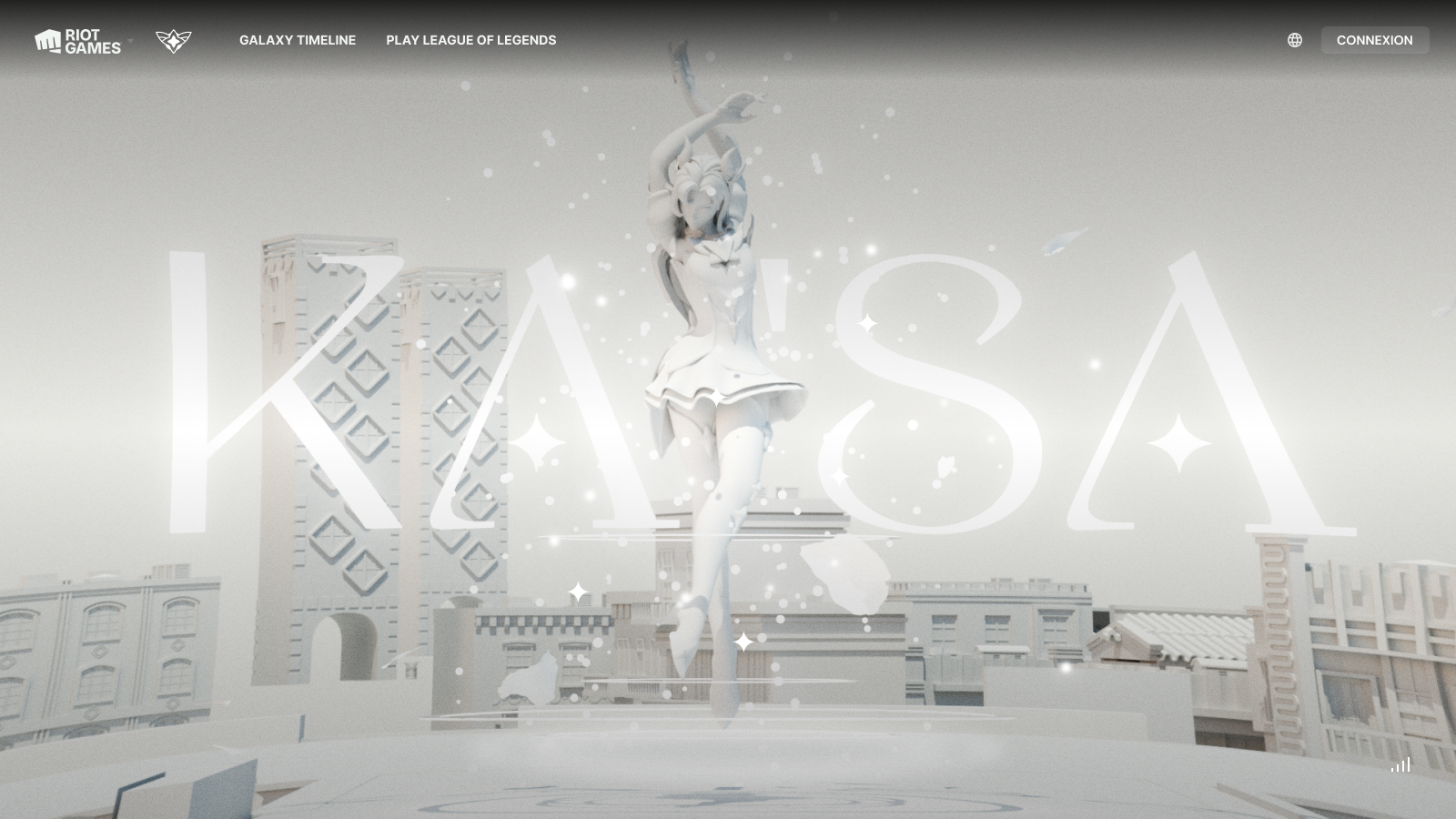
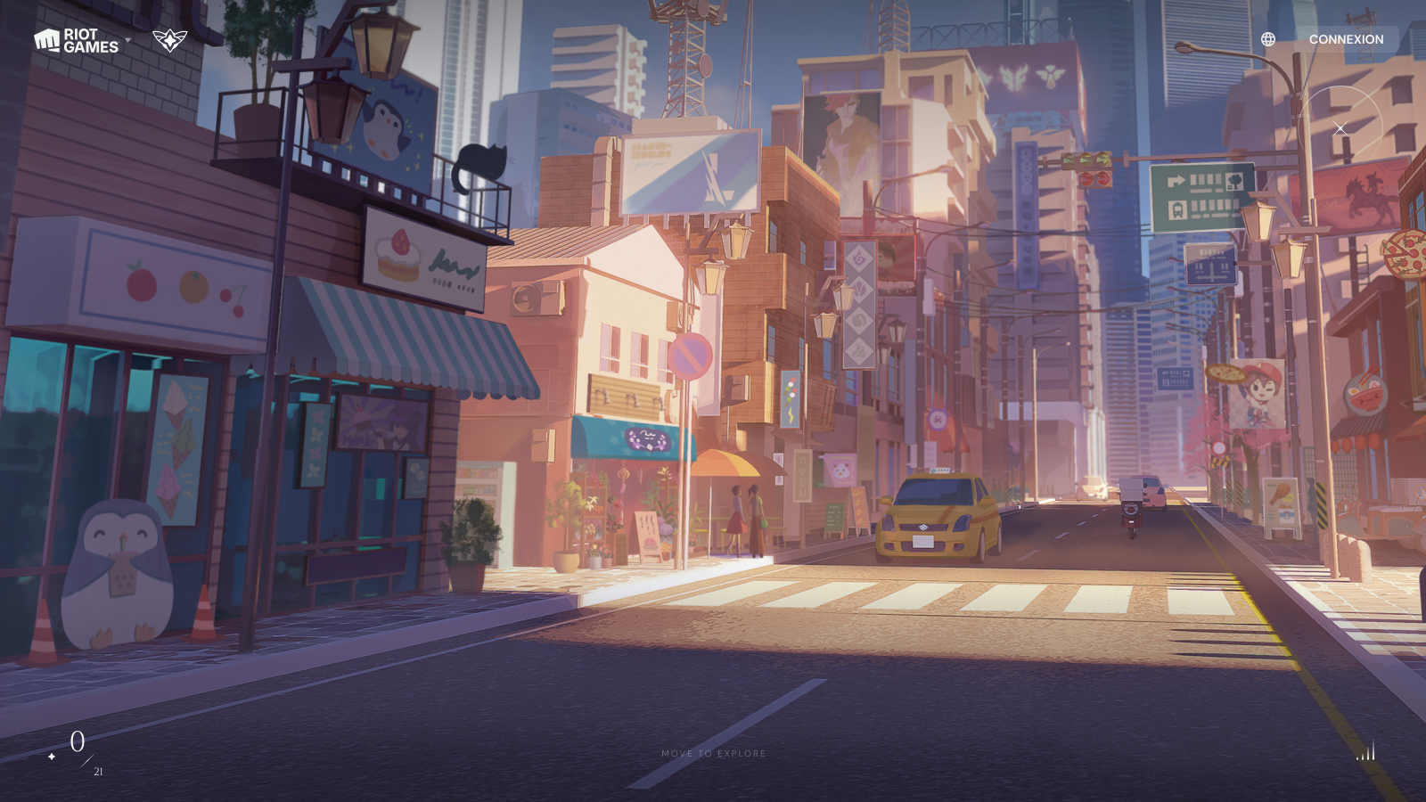
The initial concept included 2 3D models of the 2 main characters, Kaisa representing League of Legends, and Xayah representing Wild Rift. As users choose one, they would transform in realtime from their school girl form to their guardian form. This ended up not getting in the final design.
